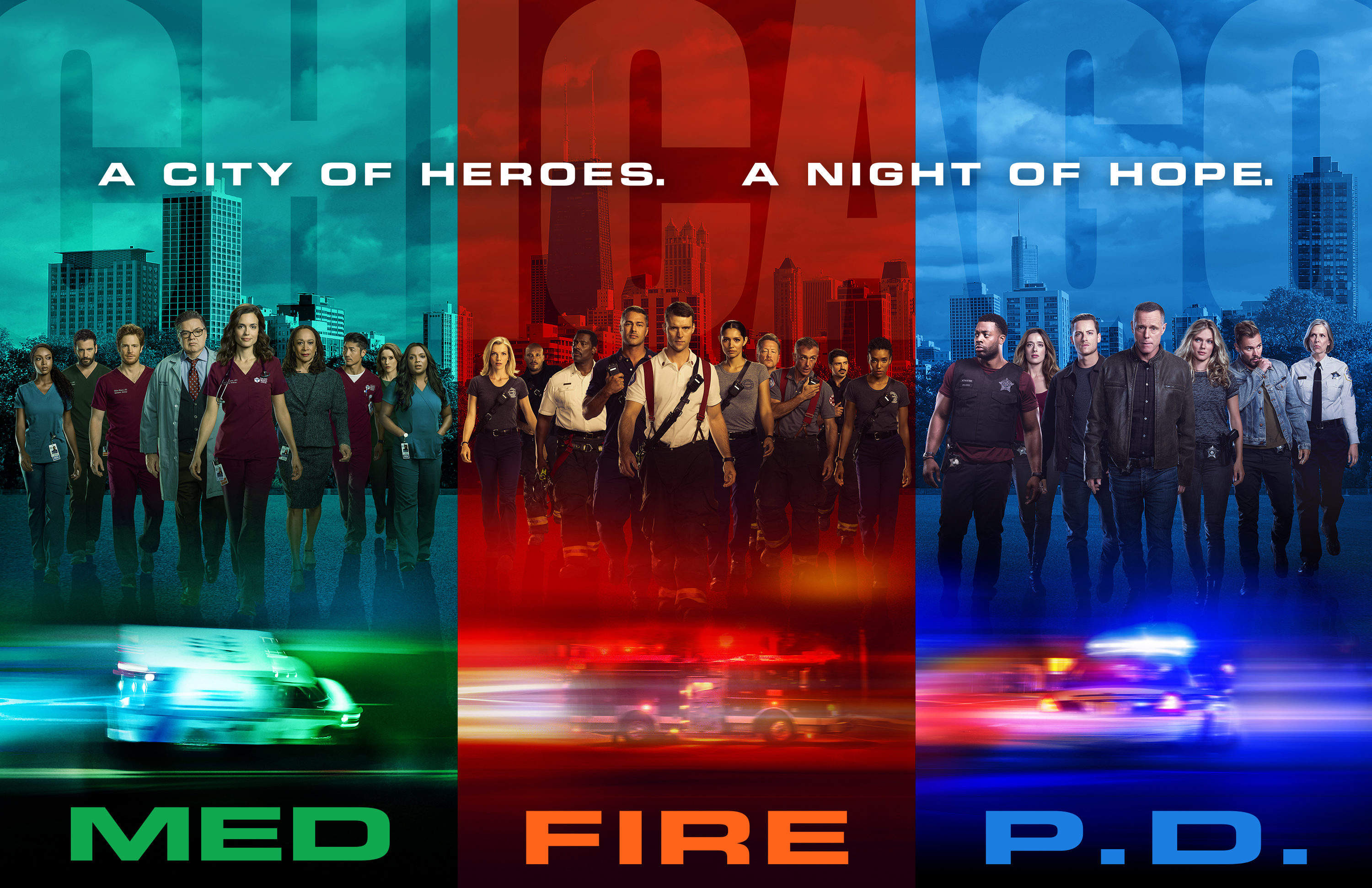
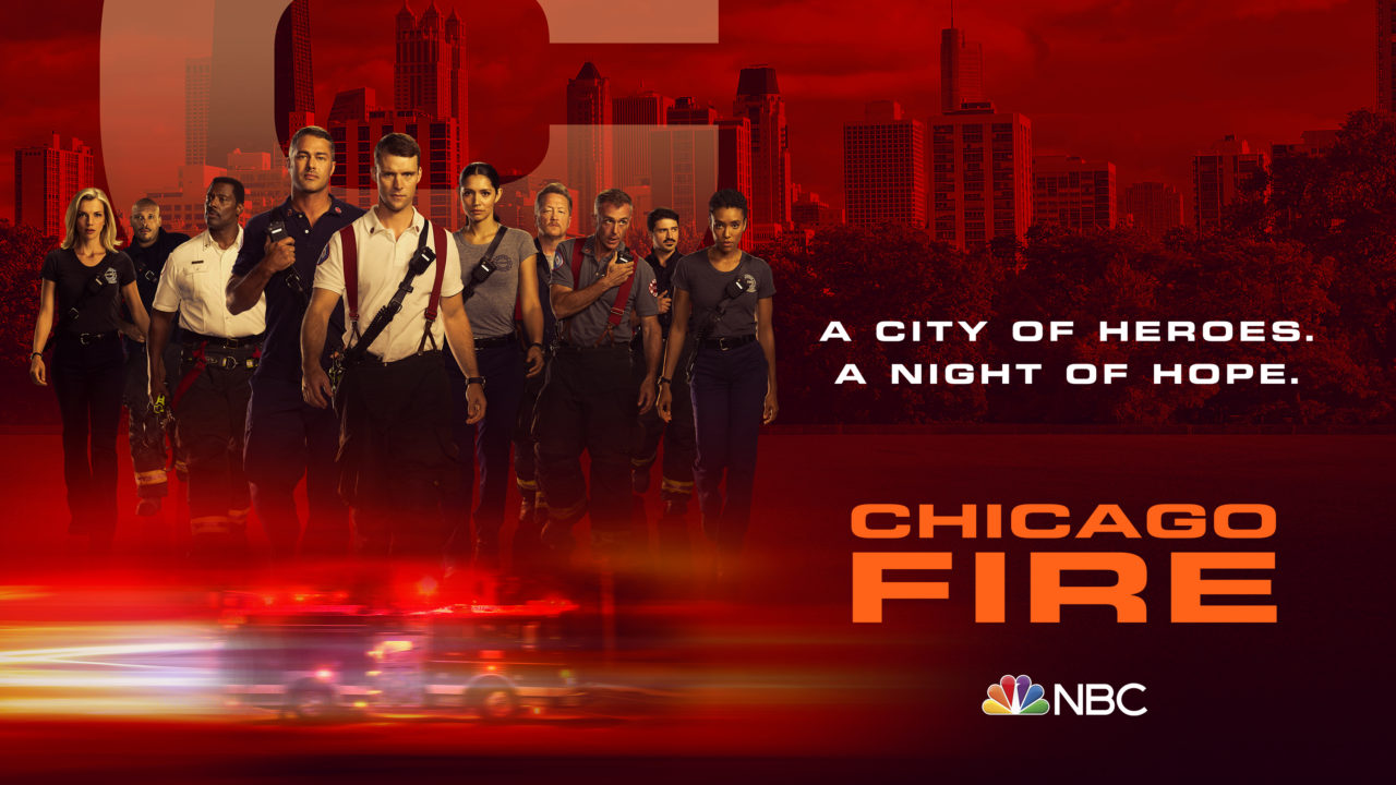
ONE CHICAGO — Pictured: “One Chicago” Key Art — (Photo by: NBCUniversal)
Spotlight: Michelle Boston
We sat down with Michelle Boston, who leads the design team that crafts the key art for “Chicago Med,” “Chicago P.D.,” and “Chicago Fire” to learn how the artwork for this season of #OneChicago was created. Key art is oftentimes the entry point to a series, and Michelle shed insight on her team’s creative process, how digital media has shifted the art form, shared words of advice for aspiring designers out there, and more.
From the cast photoshoots to the final editing of graphics, how do bring all of the moving pieces together to craft cohesive and eye-catching key art? How many rounds and iterations usually take shape before the final version?
My team and I have a creative kickoff meeting where we are given an overview of what the upcoming seasons will bring, and we work with Rebecca McGill to find out who is returning and how the creative team sees the artwork moving the story forward.
My team then goes back into design mode and we have a collective brainstorm meeting—we just throw out ideas, paying close attention to the storylines from the season and how we want to position the show visually.
I also work with the brand strategy team. They have their own have creative brief and my team tries to pull everything together utilizing the key points laid out in that brief.
We create sketches or work with existing photography—in this upcoming season we did that for the Chicago shows. The photo team tries to bank as much photography as they can so we don’t interrupt the production schedule, but if we have a new character or someone changes their look then we have to go back and re-shoot.
With the photos in hand, we cull down our ideas from our brainstorming session to see how we can mix the existing photography with our new ideas. Once we have the design comps in order, we work with the copywriting team to tie the visuals and copy together in one set piece of key art. From there, we submit the first round of comps—about fifteen to twenty—to the EVP of the marketing department, and they narrow them down to maybe eight to ten to submit to president of marketing. After the second round of cuts, we send the explorations to the producers who choose one or two, adding in more notes on storylines and arcs so that we can fine-tune to work.
It’s a lot of moving parts, but it’s a ton of collaboration from beginning to end.
In what ways does the key art work as an extension of the season’s story and series arc?
With “Chicago Med,” we didn’t know if Natalie was going to survive. When it comes to key art, we want to sustain suspense with the cliff-hanger, so we keep the entirety of the cast in the work so that we’re not giving anything away.
How would you describe the overall vibe of the key art for each show?
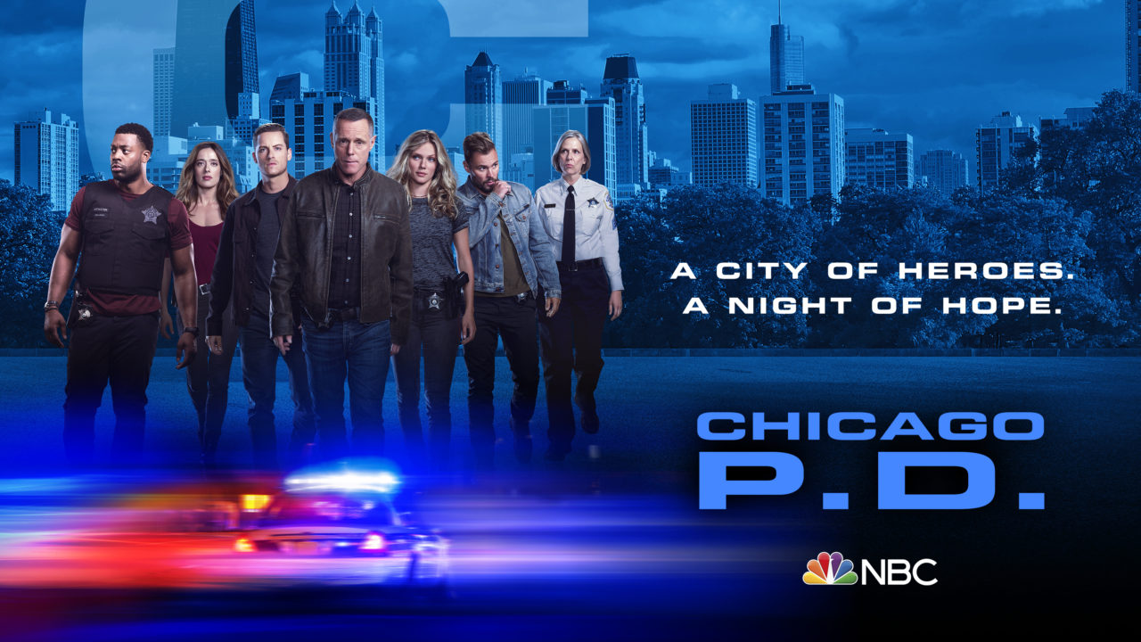
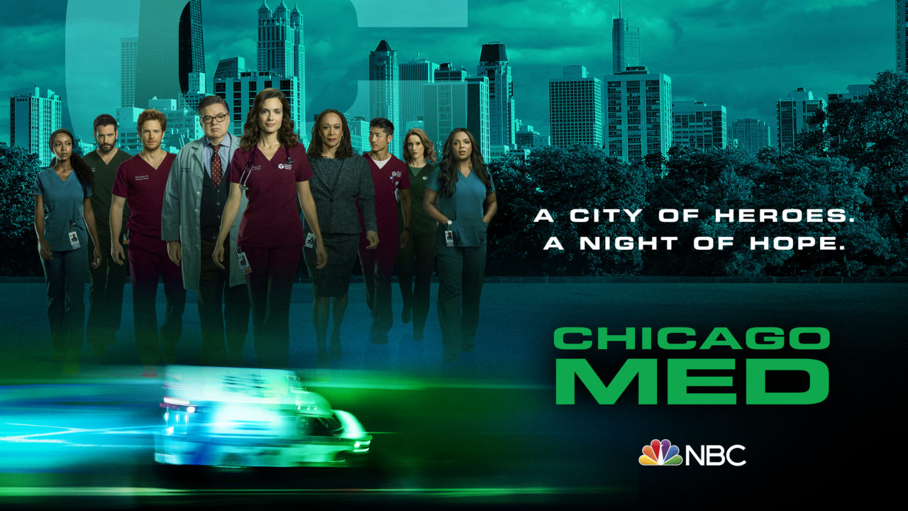
“Chicago P.D.” is very intense but there is almost an element of humanity that carries every storyline through. “Chicago Med” is all about creating this world surrounded by emergency. Personally, I find “Chicago Med” to be one of the more interesting shows, because they touch on real life situations. I find it fascinating. We bring this element of intrigue into the work as well. as to the diagnoses that they come up with and what they’re tackling. Things you would never imagine. For “Chicago Fire,” it’s about the adrenaline rush as well as human connection; that firehouse is definitely a family.
As seasons pass by, cast members change, and tone varies, the key art follows suit, especially in long-running series. Can you tell us a bit about the evolution of the key art over the years?
I was the project lead for “Chicago Fire” when it first came to the network. I remember Dick Wolf describing it as “ER” in the firehouse. After reading the pilot script I totally got that. Our task was to find a way to make this show different from the rest, and the basis of the show already gave us a lot to work with.
Whenever we encounter a new show we get on a call with the strategy and marketing teams as well as the producers. We get an overview of show and an idea as to what we can anticipate. We talk about who has been cast, the storylines—we ask a ton of questions so that we understand their vision from the very beginning. For “Chicago Fire,” we were challenged with trying to convey the vision of the series with a piece of key art that was representative of the show and intrigued viewers to time in.
What’s your secret to creating captivating and intriguing key art that simultaneously serves as a pivotal marketing tool?
Our team does their research to see what’s out there. Our challenge is always centered around how we can make our work stand out amongst the rest of the content that is out there, especially when it comes to content that is a bit similar to our show’s premise. With research in hand, we focus on how we make our work look better, how we can sell the show, and make it rise to the top amongst the plethora of shows that are out there. With the Chicago franchise, all three of the shows blend together, so it is seamless—we haven’t seen any other shows out there approach it this way where the worlds come together with ease.
How have you seen the industry standards of what constitutes key art shift throughout the years?
Today we have to think about the different platforms that will house our art. It’s one thing to see key art on a billboard and a magazine, but it’s so different to see it on an iPhone or iPad. Even today, I come across key art for earlier seasons and I’m instantly brought back to that storyline; it’s very cool to see how it all evolves over the years, and the digital marketing landscape enables us to really enjoy that in a way.
What words of advice would you give to someone eager to embark on a design career that is situated within the entertainment industry?
They need to have a love and passion for entertainment; for television and film. A lot of it is having a good sense of design, knowing what’s appealing to audiences, and having the ability to come up with an idea that stands out from the rest because, like I said, there is so much out there. We are being barraged by content, so designers always need to strive for creating something that will draw someone in and captivate them so that they’re wanting more.
You can be driving down the street and see a billboard with cool key art, but there is always a thought and larger idea behind it—the conceptual idea is something designers should always lead with. I also think it’s so important to be open to constant reinvention. Once you get your first piece out the door the creativity doesn’t stop there. You have to be thinking about the next season and what’s ahead. You’re only as good as your last piece of key art.
What would you say is the most underrated yet entirely useful skill that a designer can have?
You have to be really well-rounded. You also have to understand how your art can parlay into the digital platform in addition to how it works on-air. Thinking in those terms is imperative for success. For a designer or art director starting out, I’m a firm believer in cross-training; in understanding what it’s like to work for the on-air department, taking their ideation process and working it into what we do.
It’s so important to understand all other forms of media so that when you do come up with a design or a piece of creative, it is all cross-platform. What works in print doesn’t always work in digital or on-air. Keeping that in mind helps designers come up with pretty unique pieces. You don’t have to learn everything about each department and platform, but just understanding the machinations behind each medium and how they are creative developed is such a powerful tool to have.
Again, it is all about collaboration. It really is one of the most important things in this business. Work together and be open to new ideas. It’s what makes your work better each and every day.